

Thursday, 14 April 2011
Design Against Fur 2011
Here's a sneak preview of the entry from myself and Jeremy Freeman-Wood for the Design Against Fur 2011 competition. The brief states that the solution is to show how that animals are suffering on Fur Farms, and bread just for there fur.

Concept Personnel
Here is a helpful article about how to make an internship successful from Concept Personnel, a large recruitment agency..
http://www.conceptpersonnel.co.uk/blogMore.php?id=172
http://www.conceptpersonnel.co.uk/blogMore.php?id=172
Notes on a Logo- Pentagram
Here is a good video where Michael Bierut talks about creating a logo for the New World Symphony, a Miami orchestral academy that had just moved to a new campus..
http://pentagram.com/en/new/2011/04/new-world-symphony-video.php
http://pentagram.com/en/new/2011/04/new-world-symphony-video.php
Tuesday, 12 April 2011
27b/6
Here is a site of a Graphic Designer, responding to peoples emails, in a not so friendly way..
http://27bslash6.com/missy.html
http://27bslash6.com/missy.html
Graphic Designers Presentation
This is the presentation that I gave to the class last week on graphic designers, we did this presentation as a group. I realise that I have posted articles on these designers previously, but I thought it was worth putting the presentation up too.


I Love Typography
Here is a site with some excellent articles on typography, pointed out to me by Potts Print (UK)..
http://ilovetypography.com/
This is definitely worth a read for anyone with a love for typography.
http://ilovetypography.com/
This is definitely worth a read for anyone with a love for typography.
Thursday, 7 April 2011
Jonathan Barnbrook - A background knowledge
- Jonathan Barnbrook, born 1966, is a British graphic designer and typographer.
- Barnbrook trained at Central St Martin's and at the Royal College of Art.
- Recognised for his work on the cover artwork of David Bowie's 2002 album Heathen which featured the debut for his 'Priori' typeface.
- From 1997 until 2003, Barnbrook collaborated with 'Young British Artist' Damien Hirst, most notably on the design, layout and typography of his book 'I Want To Spend the Rest of My Life Everywhere, with Everyone, One to One, Always, Forever, Now'.
- Barnbrook has also contributed work to, and art-directed two editions of Adbusters.
Si Scott - A background knowledge
- Si Scott is a UK based graphic designer who shares his time between London and Manchester, purely for inspirational purposes.
- He left school at 16, heading to art college to do a BTEC, foundation and then degree courses.
- His work has been commissioned by Nike, Casio, UNICEF and BBC.
- He believes that computers are relied upon far too much by designers.
- He has an unique, intricate style, hand-drawn with lots of detail.
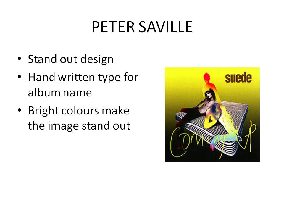
Peter Saville - A background knowledge
- Peter Saville (born 9 October 1955) is an English art director and graphic designer.
- Studied graphic design at Manchester Polytechnic from 1975 to 1978.
- Saville became a partner of Factory Records along with Wilson, Rob Gretton and Alan Erasmus.
- Saville designed record sleeves for Factory Records artists, notably for Joy Division and New Order.
- In 1979 Saville moved from Manchester to London and became art director of the Virgin offshoot, DinDisc.
- In 1993 Saville left London and moved to Los Angeles to join ad agency Frankfurt Balkind with Brett Wickens.
- In 2004, Saville became Creative Director of the city of Manchester, as a consultant.
- In 2010, Saville designed the England football team home shirt.
Seb Lester - A background knowledge
- Trained in Graphic Design at Central Saint Martins, and works in London as a type designer, illustrator and artist.
- Worked at Monotype Imaging as a Senior Type Designer for 9 years.
- He's created typefaces and type illustrations for some of the world's biggest companies, publications and events, including the likes of Apple, Nike, Intel, The New York Times and The 2010 Vancouver Winter Olympics.
- Currently creating limited edition prints, which are becoming more and more popular.
Wim Crouwel - A background knowledge
- Wim Crouwel is a Dutch graphic designer and typographer
- Founding member of Total Design
- Created the typeface, New Alphabet. According to Crouwel it was 'over the top and never meant to be used'
- Couwel's work is known for its use of grid-based layouts and typography that is rooted in the International Typographic Style.
Thursday, 17 March 2011
Dave McDonald - Key Interview Points
The 3 key interview points are Personality, Portfolio and Passion
PERSONALITY:
- Relaxed - Relax in the interview, your talking about a common favourite subject in design, theres no need to be nervous or uncomfortable
- Professional - Be punctual and have a professional attitude
- Honest - Be honest about your work, you will ALWAYS get caught out
PORTFOLIO:
- Genuine - Be genuine about your work and what you've done, you'll get caught out if it's not your work
- Confident - Be confident about your work, be proud of your portfolio
- Receptive - Take note of all advice given to you in the interview. These are respected designers with a lot of experience
PASSION:
- Brave - Be brave, talk about your work and take all opportunities thrown your way
- Committed - Be committed to the cause, don't give up
- Positive - Always have a positive outlook, it'll get you far
In Dave's opinion, these points can get you the extra yard on other designers trying for the same job.
Dave McDonald
Today Dave McDonald of Infinite Design gave a talk on his career, his work and advice on how to get a job.
Key Points on Dave's career so far:
- Graduated at Newcastle College 1996
- Went to London
- Worked at two leading companies
- Returned North after realising london wasn't for him
- Unemployed for 12months
- Took a design job, but quit on his 1st day
- Got a job for Infinite Design
Key Points on his work:
- Had an influence on 'Dancecity' design. He worked with the architects and created a well recognised brand
- Worked on Metro branding
- End Clothing brand work
- Virtual Motion Dance Company brand work
- Saints Hotel Newcastle
Key Advice:
- Source own projects to build portfolio
- Be honest with yourself - Is it what you want to do?
- Collaborate and become friends with people in the industry, and different specialisms in the industry
- Agree on payments before commencing work. Always cover your costs.
Tuesday, 1 March 2011
Top 5 portfolio techniques.
After research, I have found my top 5 tips for enhancing a portfolio (in no particular order)...
1. "When ordering your pages, we’d suggest starting with your second best project, and finishing with your best piece. Also, try to make sure you don't have two projects running over one spread. You’ll find that as you’re explaining the first page of the spread, the next project is being looked at before you’re ready to move on to it. To fix this, just space your projects out, even if it means you’ve one or two blank pages in there." - Thoughtful
2. "Be ruthless with your portfolio. You don’t need to show everything you’ve ever done, so choose around 10 of your best projects. The ones you get excited and passionate about. You’ll be able to talk about these with enthusiasm and hopefully, get your potential employer excited too." - Thoughtful
3. "Layout: As I said just up there, when I told you to stop archiving, your work needs to be communicated so design something that will allow it to do so. It will help to be very strict with a grid and how much you put down, but this all comes down to forgetting your work (another one-at the very top). I'd suggest going for a simple and to the point grid that allows you to be flexible." - ohshitwhatnow
4. "Landscape: is one of many ways you can present your work. And it's probably the better way to do it—but of course this depends on your work that you're presenting. If the majority of your work works better in portrait, then the answer is obvious—likewise if it's Landscape. If you have a mixture, you'll end up spinning the book around more than an empty bottle at a teenagers' sleep-over, so I suggest you be harsh with yourself: pick one and stick with it" - ohshitwhatnow
5. "Always rehearse your portfolio. I know, I know, you're thinking "Rehearse? Fuck off. If my mates saw me they'd never let me live it down." And although this may be the case, and you may just develop a fear of public speaking due to the monotonous friend-ridicule, it's still important. I always used to write out every possible thing I wanted to say about each project. Then I'd read it aloud. It allows you to get a feeling for how you sound when presenting your work." - ohshitwhatnow
Wednesday, 16 February 2011
Christine Pears - Textile Artist Re-Brand Client Feedback
“After discussions with Jonathan with regards to designing and layout, he has fulfilled all aspects of the brief I gave him. The type and colour is perfect and the layout is better than expected. I am happy with the business cards and the pattern on the back makes it really stand out, as does the logo.
I am pleased overall with the work that Jonathan has carried out on my behalf as it is all key to me and my style of work while still being eye-catching.”
C. Pears
Christine Pears - Textile Artist Re-Brand Evaluation
I found the brief I had chosen to do for my negotiated project interesting; trying to come up with a simple style that would show a handmade feel while also being showing the clients work as stand out pieces.
For the logo, I started off with research, looking at companies and independent artists who deal in textiles. A lot of the logos weren’t, in my opinion, very creative, but some did get across the point of being a textile company. As the client wanted a simplistic, type-based logo, I looked at mainly type-based research. I then come up with some initial ideas, which I showed the client and then developed the idea that the client preferred. This was shown to the client at every step of development. I am pleased with the final logo outcome as I feel it shows the work will be handmade while also looking professional and staying simple.
The stationary set was created after looking over some creative business card designs and then coming up with some initial ideas that would include the logo and clients details. I then showed the client my ideas and she chose out a pattern to put on the reverse of the business card. To get from this to a full stationary set, I looked at aspects of the design that would have to be put onto a compliment slip and letterhead, which would show consistency with the business cards. I feel the final outcome worked well, with the business card working to a high standard of being simple yet creative. The compliment slip and letterheads show consistency across the whole stationary set, which gives a professional finish for the client.
I looked at creative companies for website inspiration and decided that simple sites, with white space would be best to show off the clients work to its full potential. With the pink pattern going across the top of the pages, it allows there to be consistency between the stationary set and the website. I am pleased with the outcome of the website as it allows the clients work to stand out and doesn’t take away from how the work is produced.
Working with a client has been a learning curve for me. Having to stay in contact and allow the client to see what is going on at certain stages of the project have been a new experience. I enjoyed working with a client as it has gave me valuable experience and has allowed to me create pieces of work which will be used to promote and give a professional view of an artist. I have learned that when working with a client, I sometimes have to sacrifice my views on the designs for what the clients want.
I haven’t had to deal with many problems throughout this project, just small problems with the college facilities, such as lack of wireless internet, and broken printers. These problems haven’t really affected the final outcomes of my work, and no other problems have occurred.
Overall, I believe that I have come up with a solution to this project that works to a high, professional standard and that fitted all the clients needs. I feel that the work meets all guidelines put that were in my proposal and overall I have had a successful project.
Christine Pears - Text Artist Re-Brand
This is some work I did for a client. I created a whole re-brand of Christine Pears' Textile Art company. I created a logo, stationary set, and website.


Wednesday, 2 February 2011
NARC Magazine
I pitched an idea to be used for the NARC Magazine cover. I based my idea on shadow, and the idea that the word 'NARC' was being shadowed onto a wall.


Thursday, 6 January 2011
Placement
I'm currently on a 2 week work placement at The Point Design Consultancy. I'm gaining valuable experience on how a design company is run and how projects are handled. Hopefully I will get some more work up on here soon to show what I've been working on.
Subscribe to:
Comments (Atom)